We began creating this brand at the very early stages of the facility’s development. The Five Towns Premier will be a deluxe, upscale nursing and rehabilitation facility located in Woodmere, New York. Stately and sophisticated, The Five Towns Premier will be the choice of discerning potential residents.
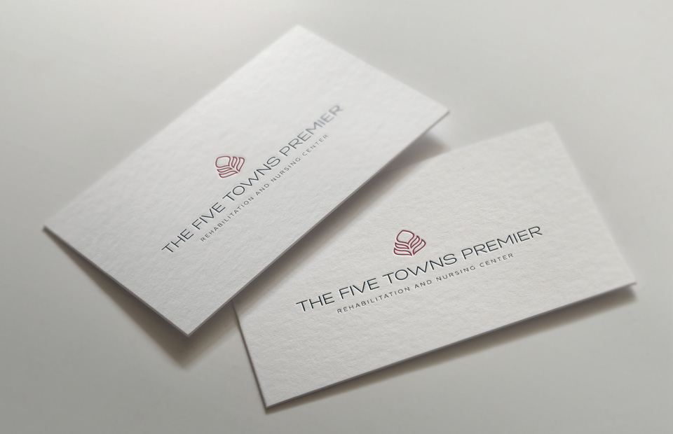
Inspired by nature, the mark is both timeless and regal, pointing upward to indicate growth. The convergence of the different segments illustrates the connections between people and multiple layers of care. Precision crafted, the symbol radiates wholesomeness and balance.
The color palette that we selected to advance the brand message is inviting and intriguing, fresh and vivid. The wide sans serif font is both clean and contemporary, a perfect complement to the logo.
Charna crafted our logo with skill, ingenuity and understanding of our marketing goals. She guided us throughout the process, and lent her expertise to every decision. Charna ensured that we selected the best color palette to match the interior design of our new upscale facility for a brand identity that is truly distinct among nursing facilities.
Elie Pollak, LNHA Administrator, The Five Towns Premier Rehabilitation and Nursing Center


 LINKEDIN
Leave a Reply