


Accordius Health manages a large portfolio of senior living facilities known for innovation and warmth.
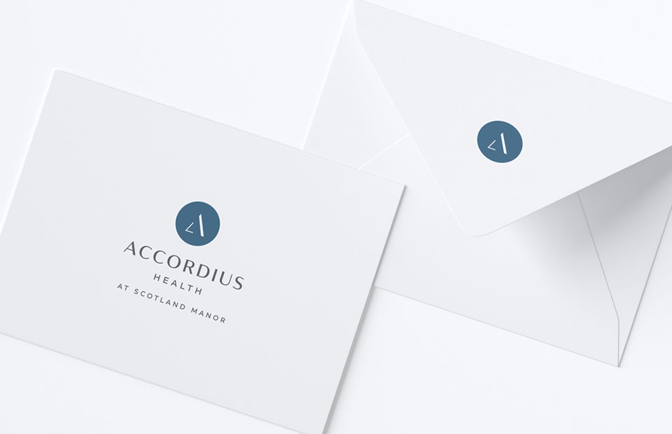
The vertical A symbol reflects positivity and growth, while the circle hints at a complete and wholesome approach. The chic typeface is paired with a blue/gray color palette for a sophisticated and memorable brand.
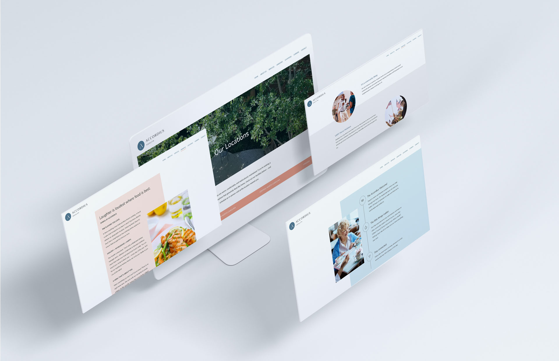
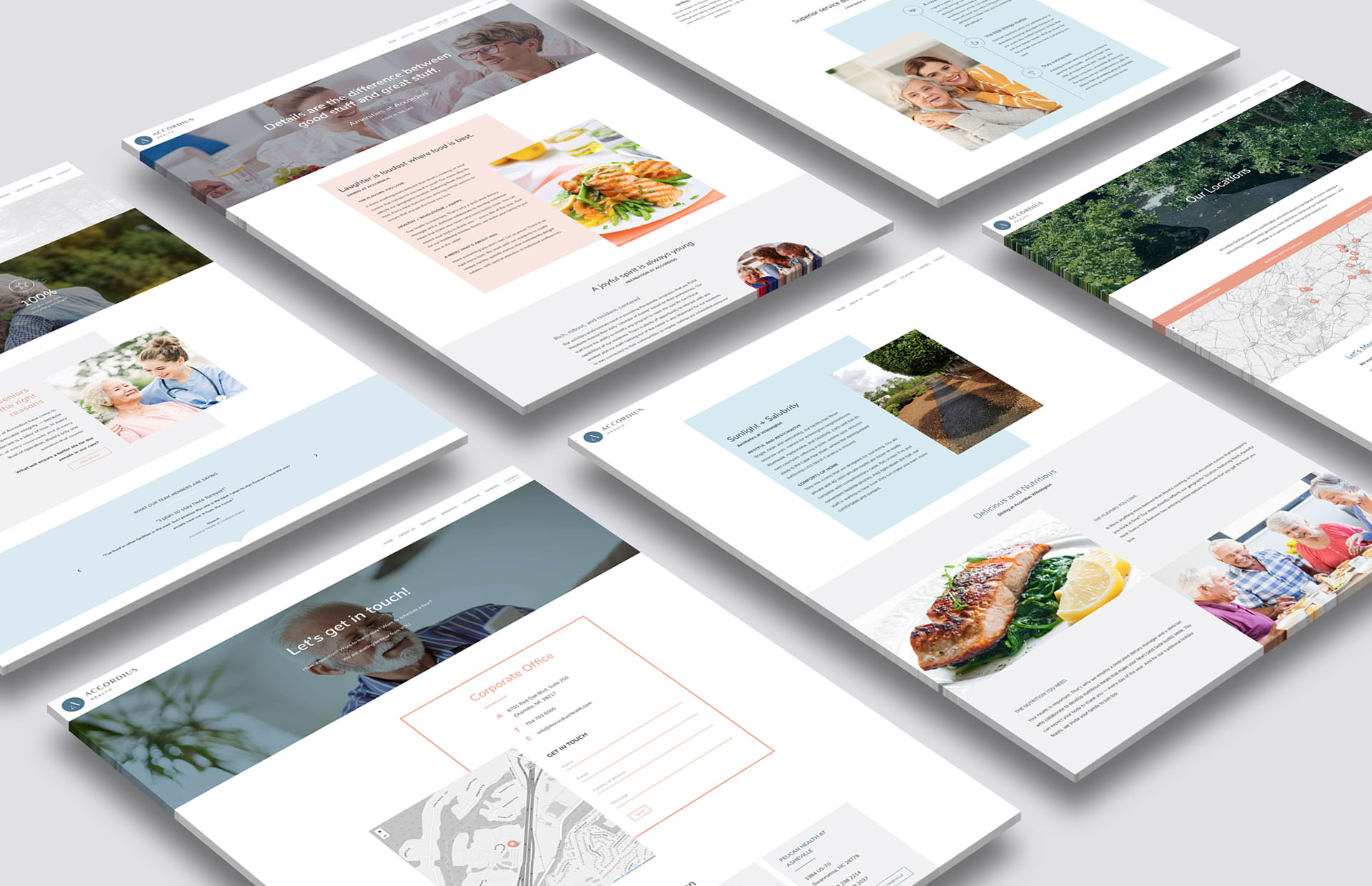
We created a comprehensive 27 page website with robust functionality and magnificent photo layouts, featuring 19 Accordius facilities.
Fresh, bright colors create a warm and inviting vibe. Gorgeous, sleek sections and subtle animations add a contemporary and professional touch. The website also includes advanced search features which can find a facility by region at the touch of a button.
Launch Website.
 LINKEDIN
Leave a Reply